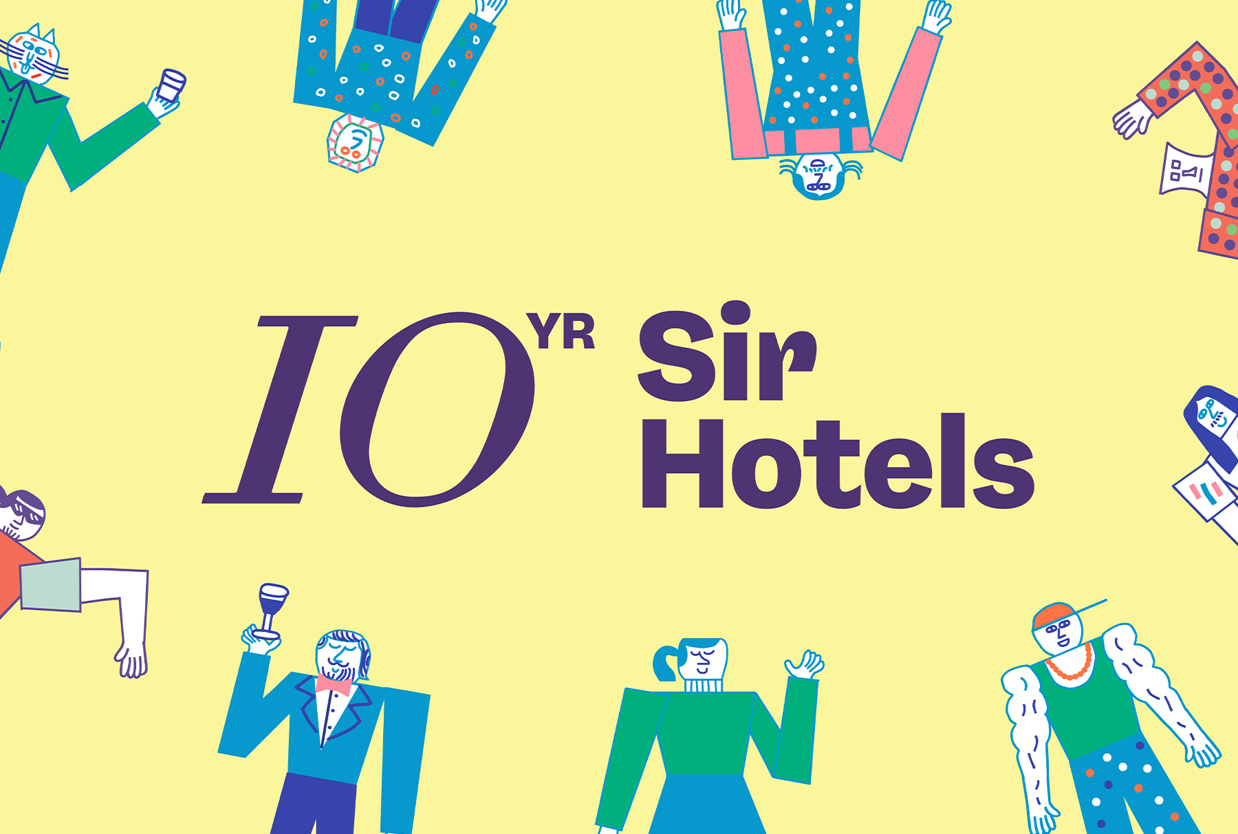
Based on the concept, we briefed an external brand illustrator to create this illustration for us. After we received the illustration I started to storyboard the animation video which was going to be main piece of communication for the campaign. During the initial state, I experimented with different colour combinations to represent the different types of characters and diverse ways to collate the video to have simple yet energetic animation. While editing the clips together I choose a fast pace and making use of the characters throughout, in combinations with
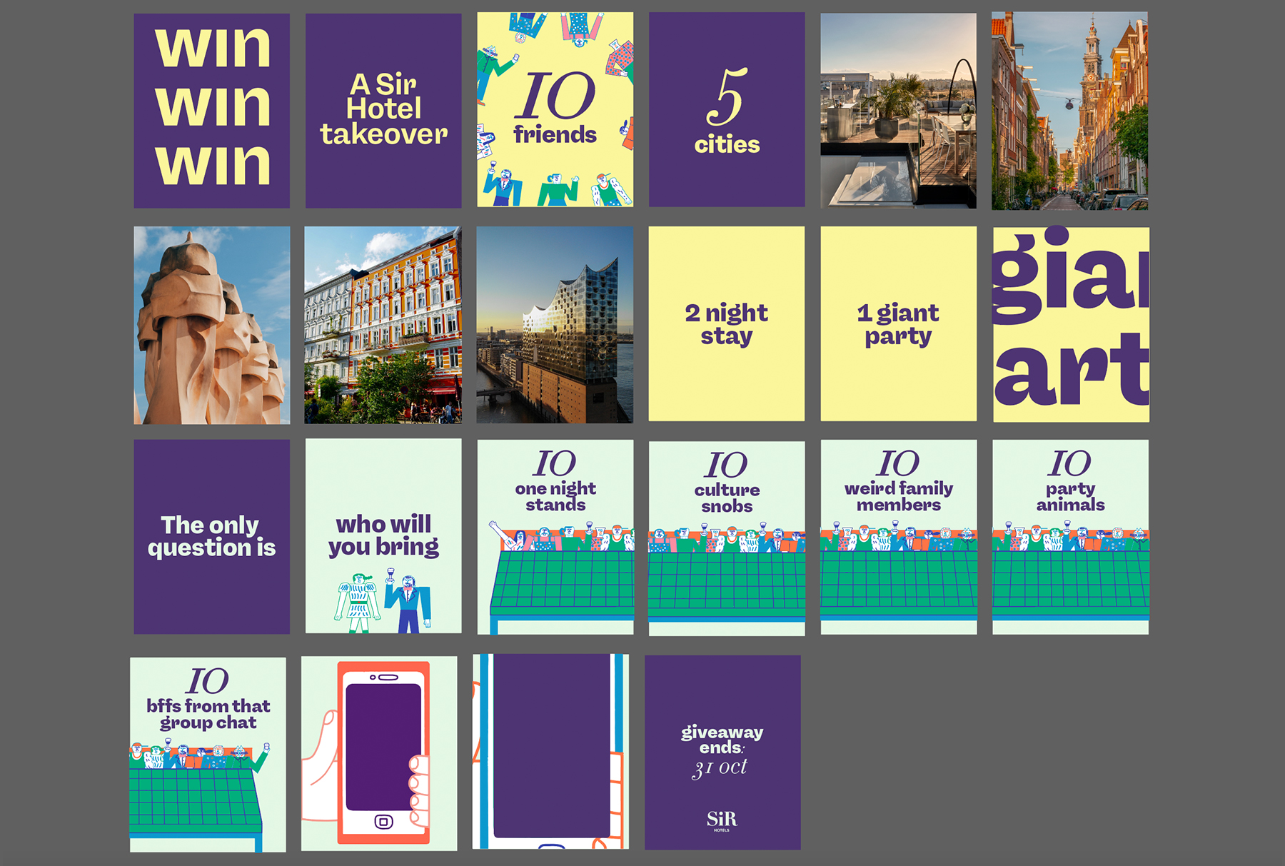
complimentary colours. To ensure the animation remained impactful yet not overstimulating, I created a balance by having the same type of transitions throughout as well as staying consistent with the text animations. This animation was used as an organic social post as well as for the social ads. For the social ads, I also designed another set of carousel posts and stories which in combination with the animation would be implemented as an A/B Testing to optimize the performance of the ads.
Additionally, I reused the hero animation to create two new videos to use as a countdown posts to keep our followers engaged with the campaign and to attract new people to sign up to the campaign. In these animations, I also explored a new technic to sync the pace of the animation to the beat of the music so the the video was more satisfying for viewers. Later in the process, this became a bit of an issue as through rounds of revision the order or length of certain bits changed so I kept needing to resync them with the music. However, through this I learned a lot, like when to start animating certain parts of animations and when to sync up the animation with the music. I learned that this needs to happen much later in the process rather than when I originally did it.
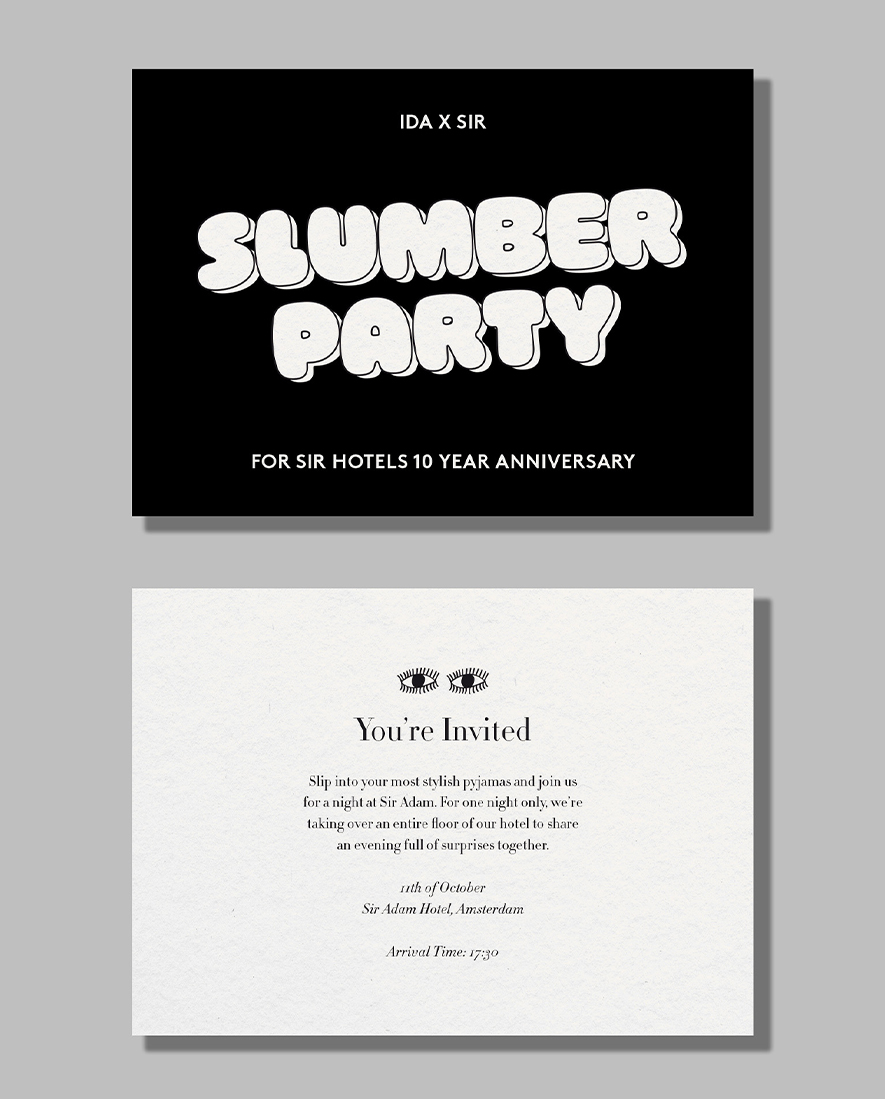
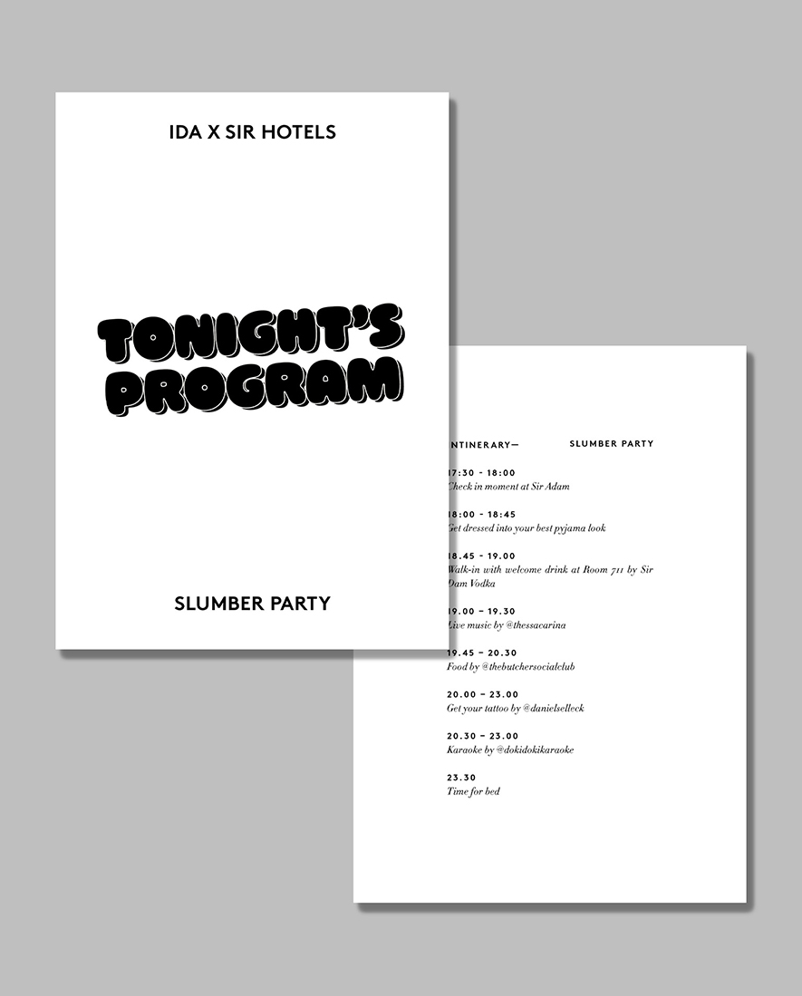
Furthermore, I was also responsible for creating all the assets for the influencers' stay. This involved producing a recap video of the evening, designing a welcoming card, crafting an itinerary booklet, and personalizing pillowcases with the names of all the participants to enhance the personal touch. In light of the activation being specifically geared towards our younger audience, I established a distinct identity that would resonate more effectively with this demographic, while incorporating certain elements of theSir Hotel brand to ensure that it remains distinguishable as part of the SirHotels family. I opted for a title font that draws inspiration from round graffiti lettering, aiming to integrate this style into the overall design. By tilting the title font and enlarging it significantly, I aimed to create the illusion that it was graffitied onto the printed collateral. Paired with a classic serif font, the design retained the elegance of the Sir brand while injecting a youthful energy into it.