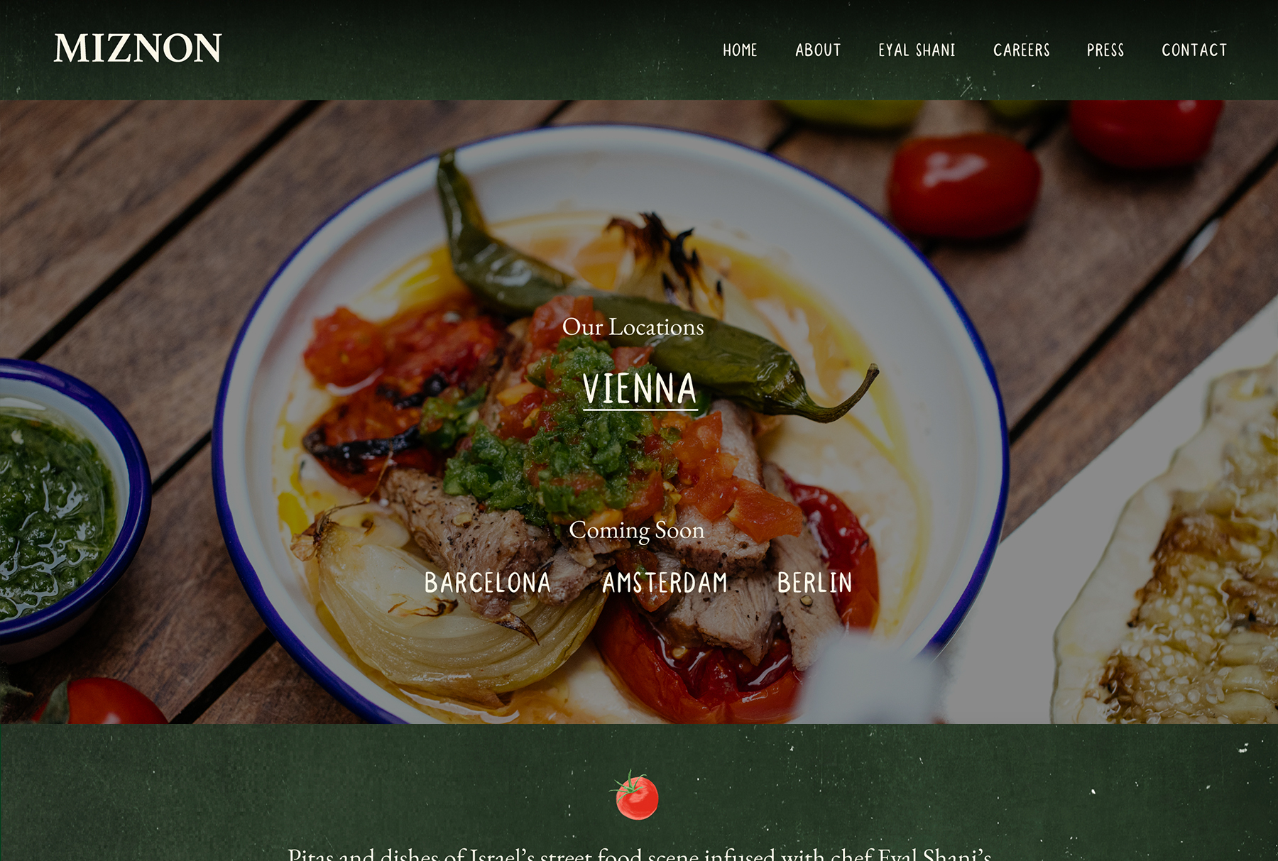
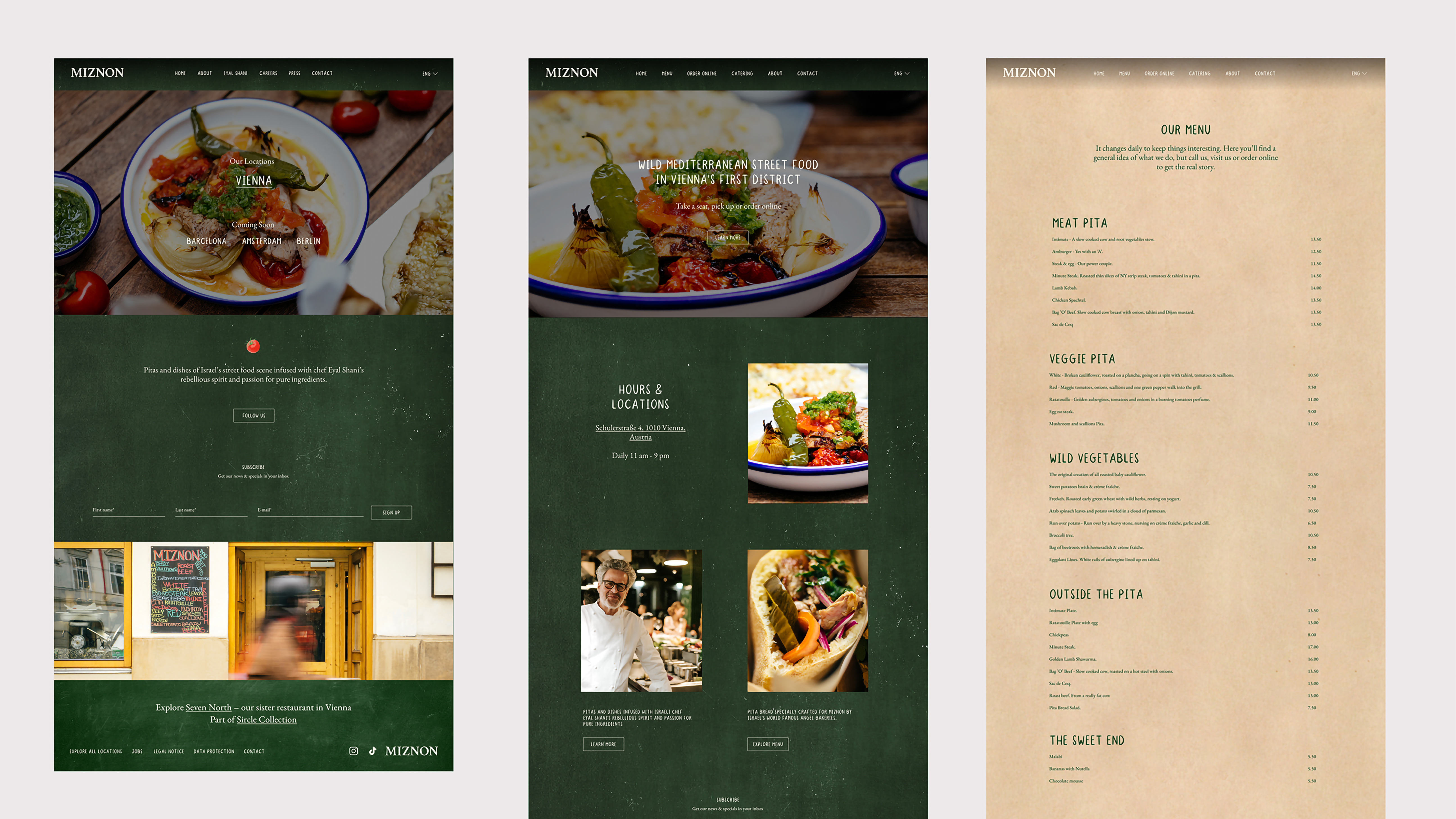
I started with mapping out the wireframe of the existing website. During this, I identified several usability issues such as an inconsistent header, too much negative space and with the journey of the website. I started by rearranging the journey of the website as one of the goals was to increase the awareness surrounding the upcoming locations, I decided to make the page dedicated to the current and other locations the new home page.
The primary CTA of the page was to link to the Vienna location page. To enhance consistency between the home page and the Vienna page, I designed a hero section that not only increased the visibility of the dishes but also created a smoother experience between both pages. Then, I redesigned the two most important design elements, the header and the footer. I simplified the header by removing the restaurant address and aligning all elements on the same height line. Despite the navigational links on the header changing between the cross page and the other pages, the design remains consistent, which previously varied between the pages.
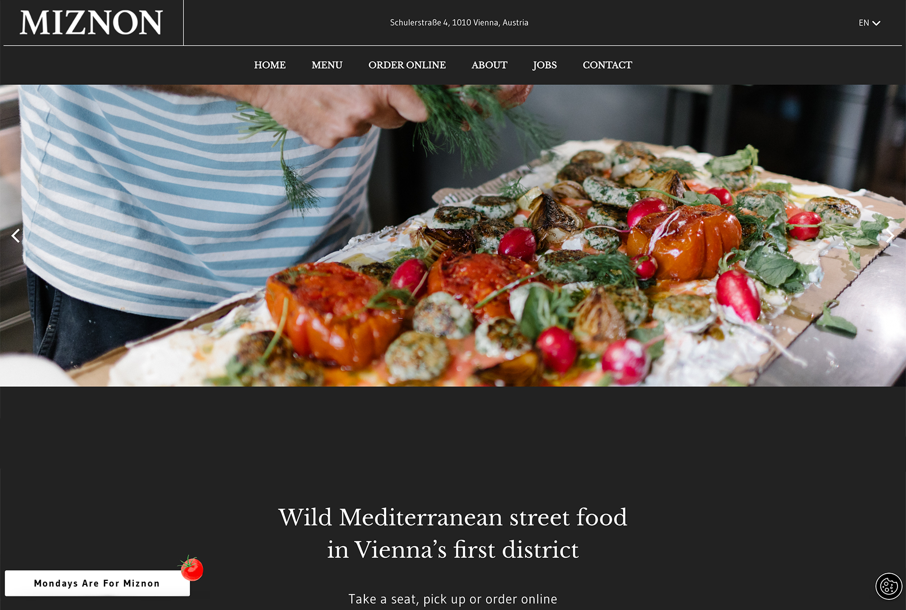
I reduced the negative space on the Vienna location page by 11% and aligned the elements side by side to make them
more consistent. I also added the opening hours and restaurant addresses, which were missing previously. Before, only one element had a CTA linking to the About page. By aligning both elements, I added a CTA linking to the menu pages to boost traffic and encourage users to explore the dishes. For the menu page,
I opted for a light brown chalk background to set it apart and make a more lasting impression on users. Alongside this, I also optimised various elements on all the different pages of the website. All these changes improved the website's usability and user-friendliness.