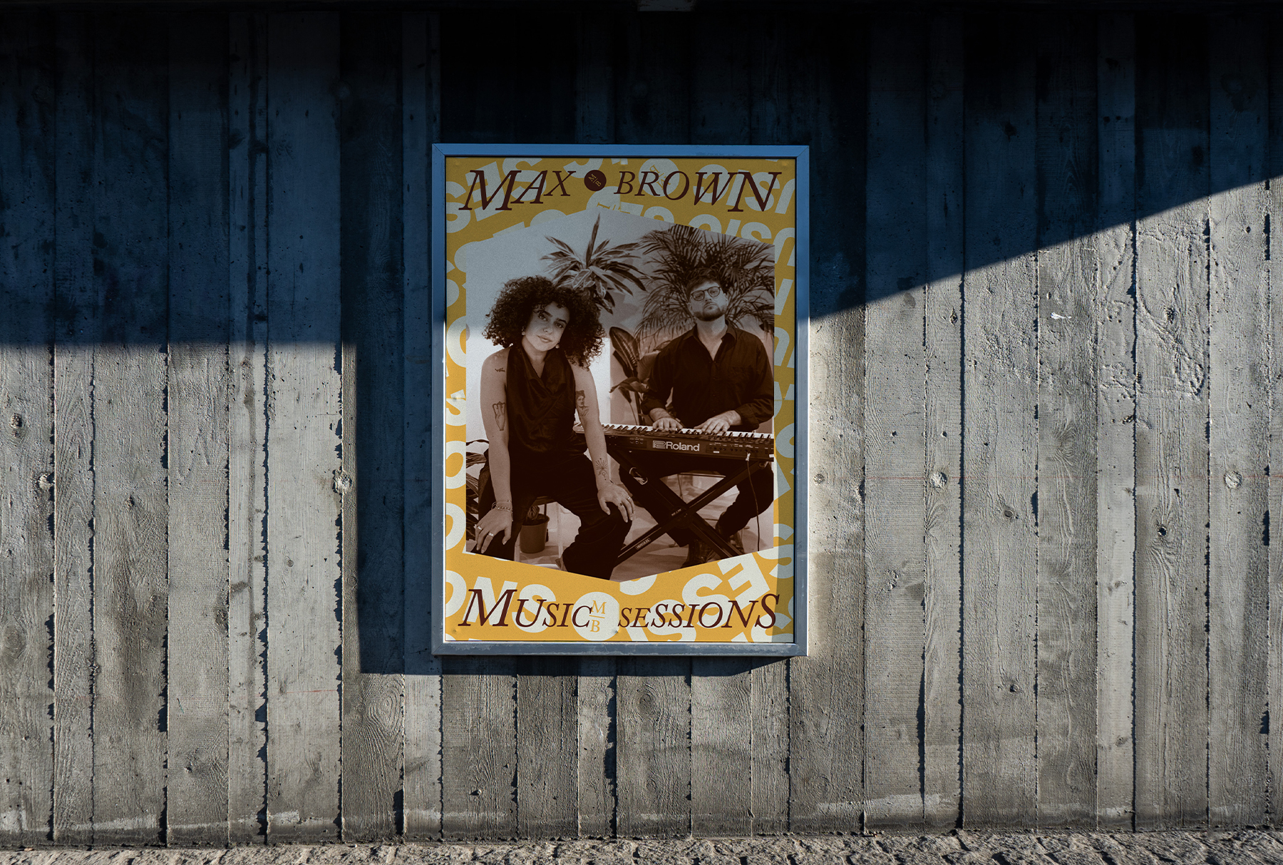
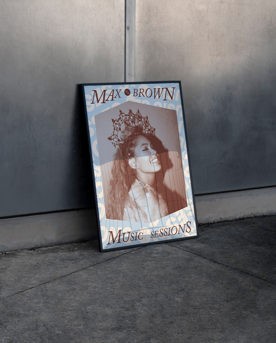
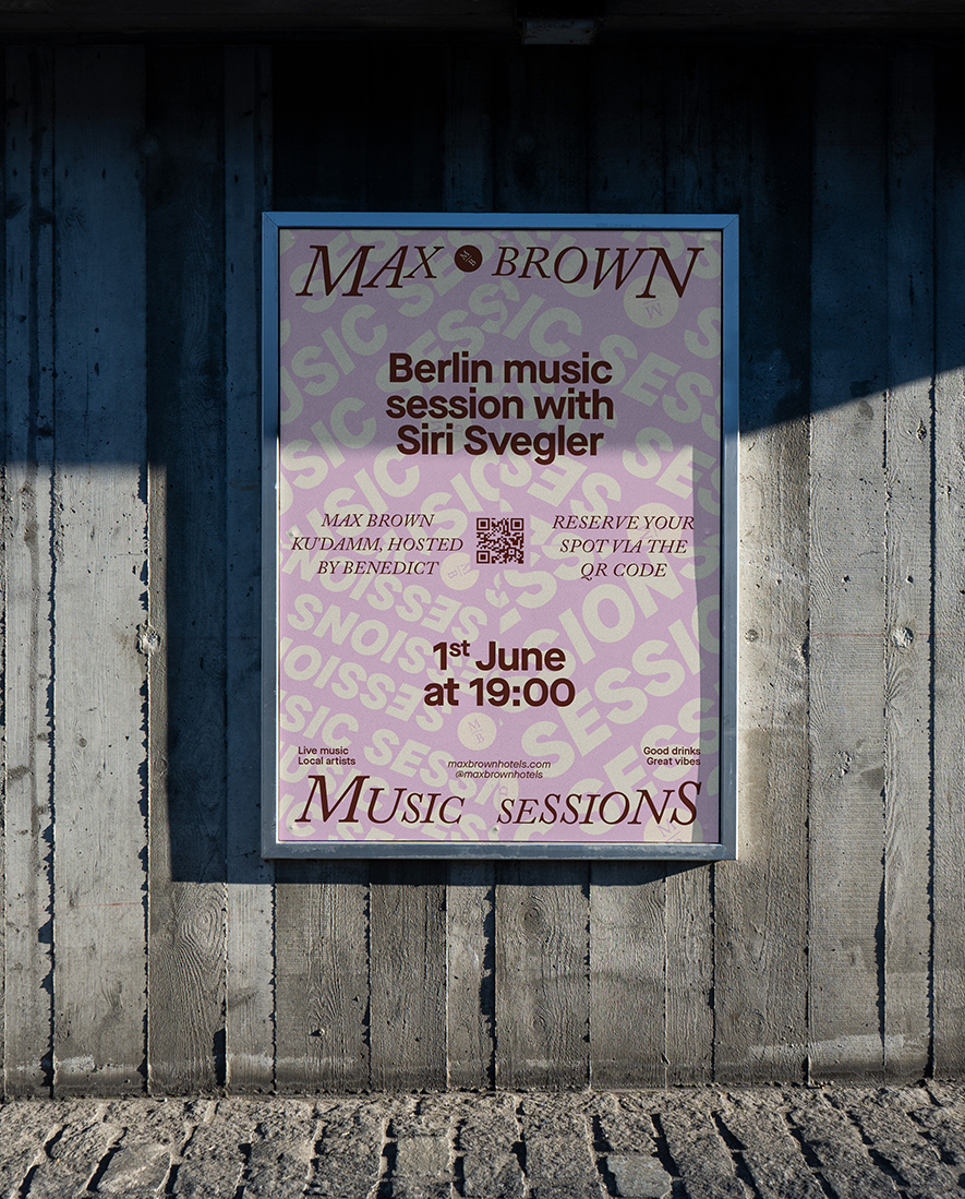
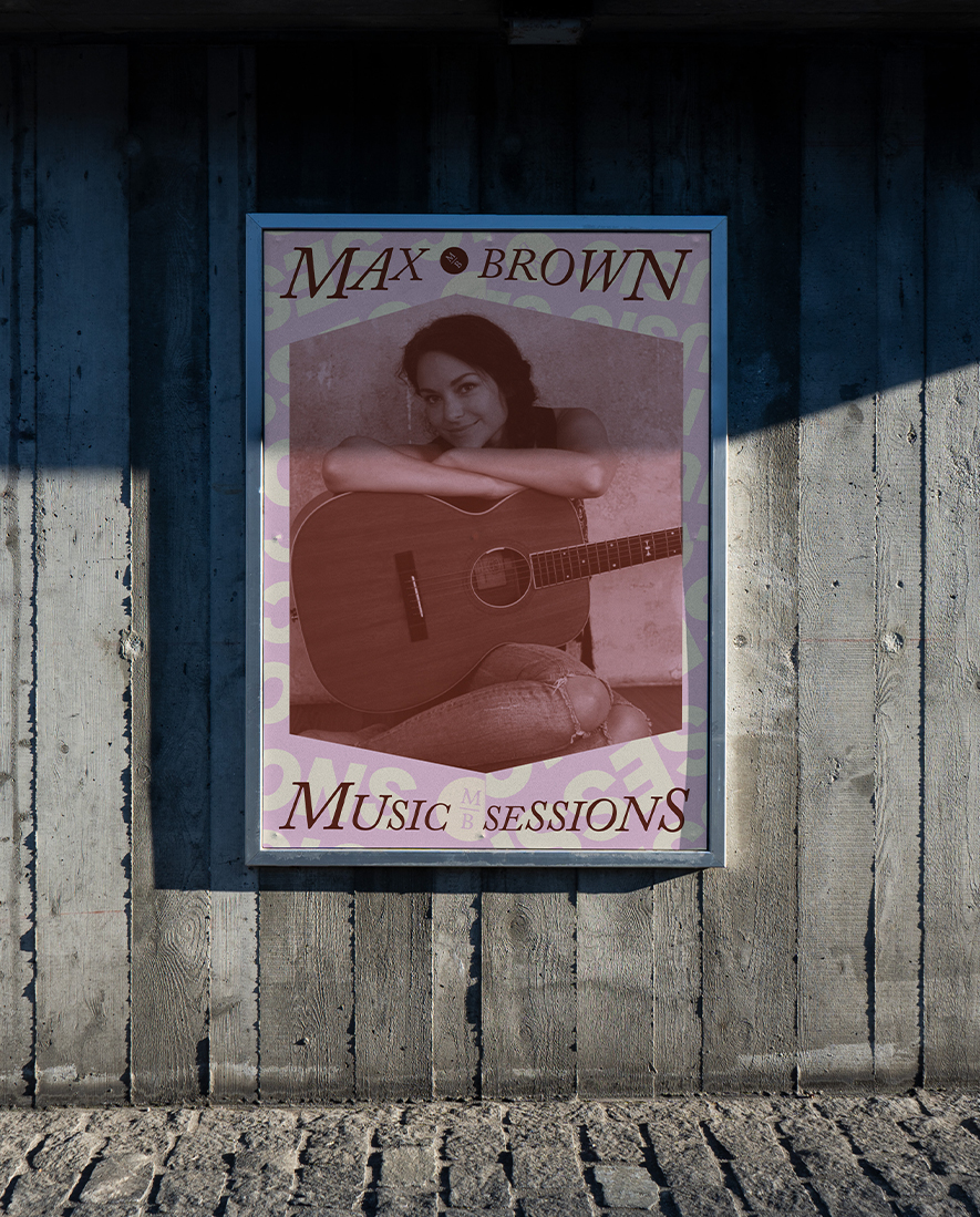
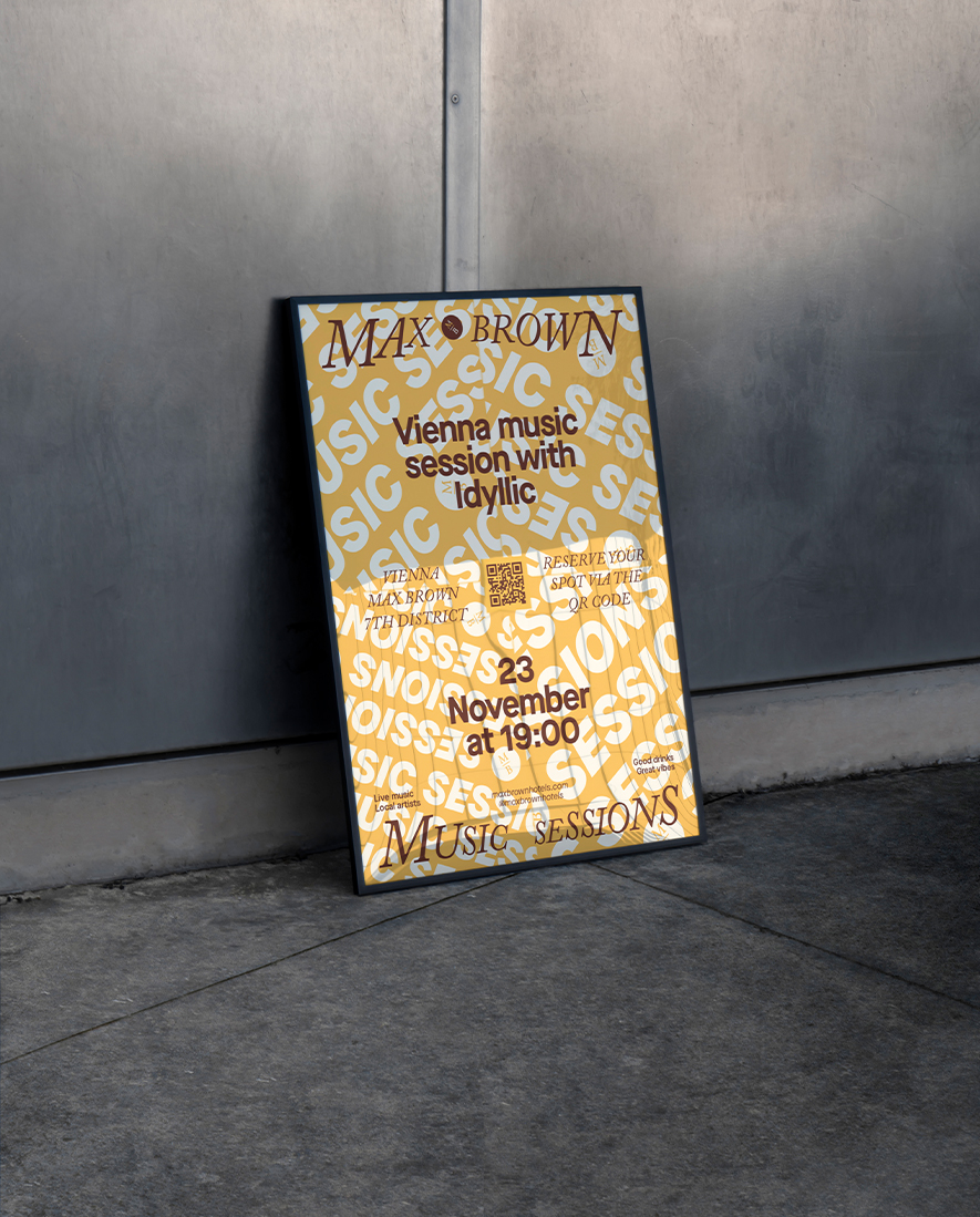
The idea for the campaign was to have a dynamic background visual that capsulated the energy of the events, this would be used across all communication channels. The main visual was originally created by the senior graphic designer before I joined Sircle Collection. After I was given this campaign, I experimented with the main visual by changing the colour of the visual to match the vibe of the artist. Making the assets of the campaign more tailored to the event making them more impactful. I turned the flyer from more than just information on a colourful background and brought it to life with a vintage 70’s soft rock orange, a soulful light blue, and a light-hearted singer-songwriter pink.